 Alpari
 XM
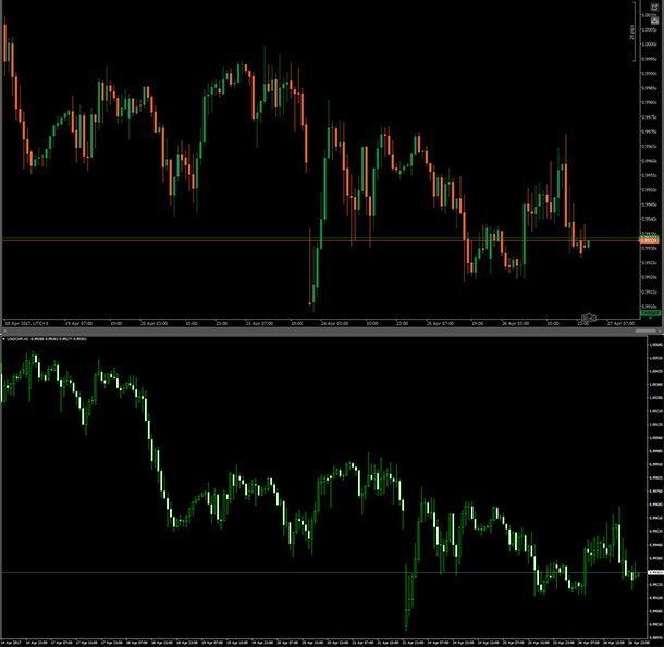
XMThere are so many technical indicators you can load onto your trading platforms, expert advisors, etc. but ultimately it comes down to what you see. It is possible to do a technical analysis of the markets just by studying the real-time Forex charts and nothing else.
Some people call this naked trading, and such a trading strategy requires, above all, a thorough understanding of candlestick patterns. Sure, there’s a lot more that goes into naked trading, but the candlesticks can tell you what’s happening in the markets at any time. (Candlestick patterns when comparing fundamental and technical analysis)
Structure of powerful candlestick patterns
Before we talk about the various patterns formed, you first need to understand the basic structure of a candlestick. I’m sure you’ve seen them already every time you opened your Forex trading platforms, but you probably never thought too deeply about the structure. Or perhaps you use line and bar charts, in which case I’d advise you to switch to candlesticks. Why? You will see soon enough. There’s so much a candlestick reveals than any other type of chart.
To start, a candlestick is formed when a trading period begins. The trading period will depend on the timeframe you’re working with, so a new candle will form hourly on the H1 chart and so on. On MetaTrader, the candle will be either filled or hollow in a bullish or bearish market respectively. There are other trading platforms like cTrader where the candles will always be filled, only with green and red for bullish and bearish markets.
When the trading period ends, a new candle is formed, and the previous one will remain either hollow or filled. Any deviations from these two points will form a ‘shadow’, which is a line extending from the end of the candle’s body. Both the body of the candle and the shadow tell a story.
Common candlestick patterns
As you study the charts, you will begin to observe some common patterns forming regardless of the market. Whether you’re trading commodities, stocks, or the Forex market, there will always be candlestick patterns. The most common ones and also the most powerful include:
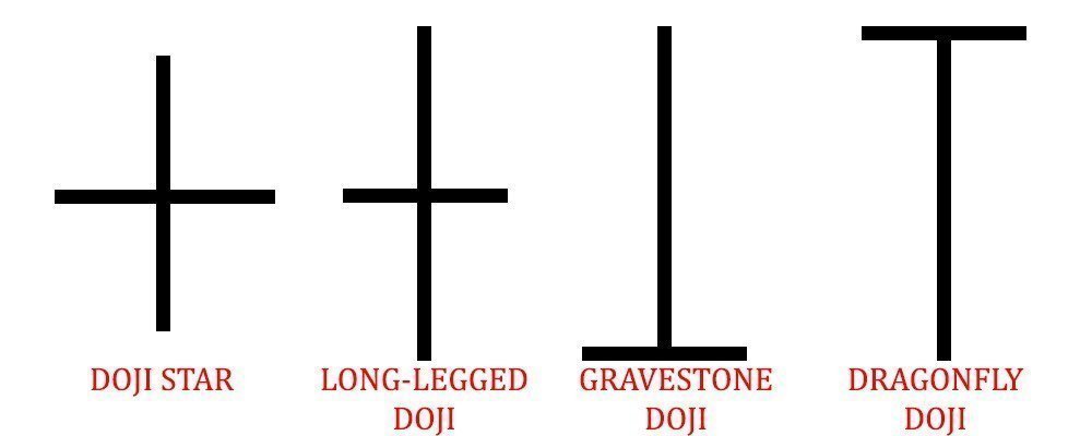
Doji
The doji pattern is one of the most powerful you can notice on a chart because it is very effective. To begin with, here is the basic structure of the doji candlestick in its different variations:
Now to look at the Doji candle in action:
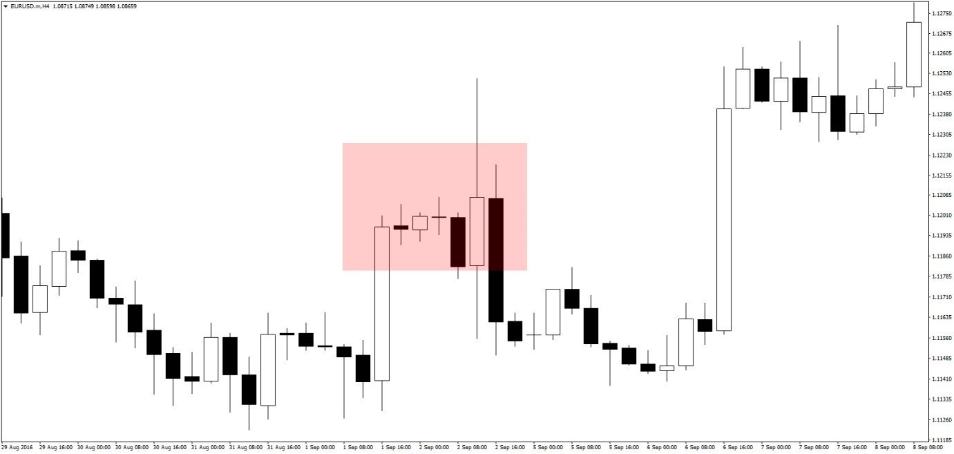
The area highlighted shows two doji candlesticks formed on a chart. The image also demonstrates the basic structure of a doji candle, even though one has a slightly longer body than the other.
A doji candle always shows that there is a tussle between the bulls and the bears, during which period there was no winner. When you see a doji candle, it shows there might be a potential reversal in trend, and the next candle after that is what matters most.
In the image above, the first doji was formed after a long bullish candle, signifying that buying power was probably running out. The next candle was also bullish, except it had a very short body, confirming that buying power was indeed running out. When another doji was formed, it was clear the bulls were closing their positions. A trading opportunity would then present on the candle after that when we see the trend turning.
The hammer and hanging man
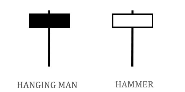
The ‘hammer’ appears at the end of a downward trend while the ‘hanging man’ appears at the end of an upward trend. Both are characterized by a shadow at least twice as long as the body.
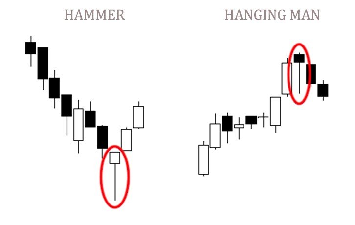
When the hammer appears, it is a sign of a dwindling downward trend – when the new candle first formed, prices started trending lower, but the bulls took control, pushing prices upwards toward the starting price. It shows that the bulls were in control toward the end, thus the probable end of a downtrend.
For the hanging man, the situation is different. The long shadow of the candle shows that once the candle was formed, the bears took control, pushing prices lower. Toward the end, though, the bulls pushed prices back up near the starting price, but were unable to go higher, showing that buying power was running out. If the next candle is bearish, it would confirm there are no more bulls.
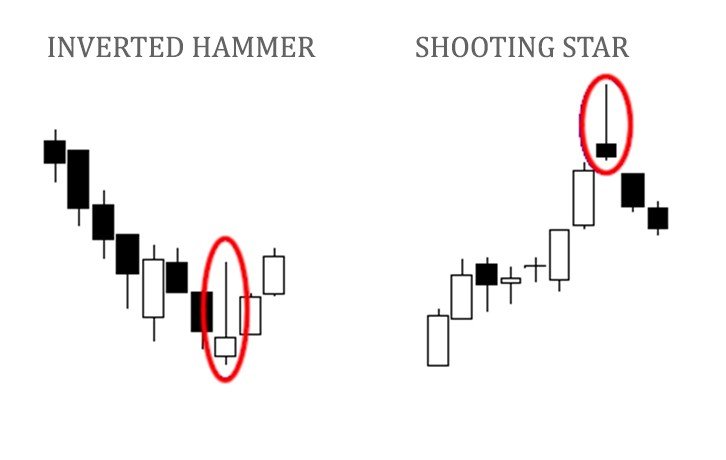
These patterns can also appear reversed, where the shadows appear above the bodies.
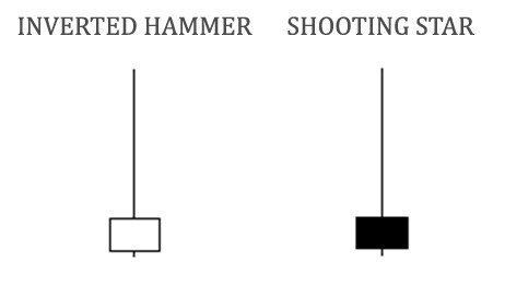
Despite the different locations of their shadows, they still provide the same signals. For the inverted hammer, it will show that a downtrend is about to be over. During the candle’s trading period, the bulls pushed prices upwards, but toward the end, bears pushed them back down to form a long shadow. Because the selling power was not enough for the ending price to go below the starting price, it is a sign that it may be running out.
As for the shooting star, it appears during an uptrend, and at first, the bulls take prices higher, but in the end, bears come in and bring them down again. On a chart, these patterns can appear like this:
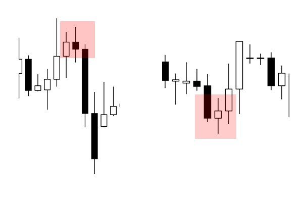
Engulfing candles
These patterns appear on pairs of candles, and can either be bullish or bearish engulfing.
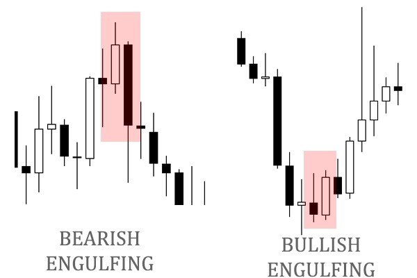
The one on the left is a bearish signal because the second candle completely engulfs the first one. It indicates very strong selling power and means there will probably be a strong trend to the downside afterward. As you can see, the downtrend did indeed continue.
On the right is a bullish engulfing signal, and the bullish candle completely engulfs the previous bearish one. There is strong bullish sentiment in this market, showing there may be a strong uptrend, which is confirmed by the following candles.
Piercing and dark cloud patterns
These appear when there is a gap between the previous ending price and the starting price of the current candle.
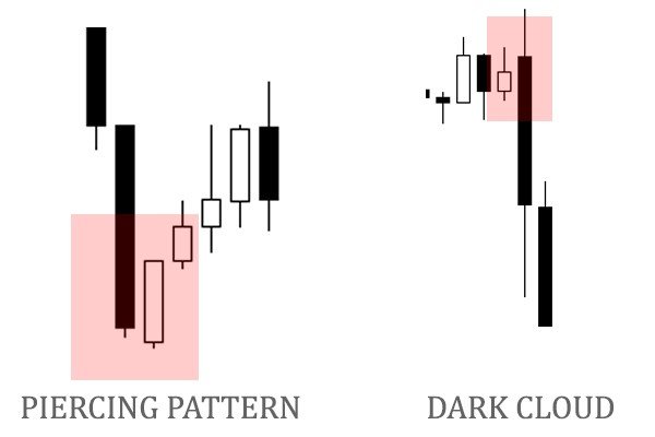
On the piercing pattern, the white bullish candle starts below the previous candle’s ending price. It indicates that there was a very strong bearish sentiment in the markets that the value of the asset was below the previous close by the time the new candle opened. However, the previous sentiment is overridden by the strong bullish sentiment that follows. This pattern shows there may be a lot of buyers in the market.
For the dark cloud, previous bullish sentiment causes the trading period to start higher than the previous candle. When the new prevailing sentiment turns the price downwards, it shows there are a lot of sellers, and a strong downtrend is coming.
Both of these patterns are common when there is a critical news statement on the Forex calendar that is different from what people were expecting. At first, the previous expectations pushed market prices in a certain direction, but when the actual data came through, market sentiment changed quickly and strongly. (Learn some of the Forex market sentiment indicators that may cause this candlestick pattern)
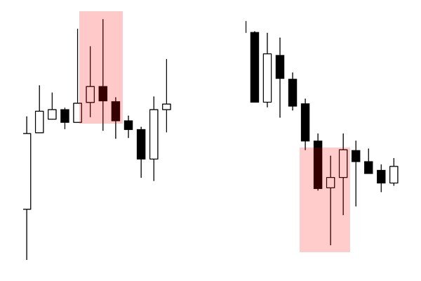
Spinning top
The spinning tops are a lot like the Doji, except that their bodies are longer. The similarity is that the spinning tops, just like the doji pattern, show a tussle between the buyers and sellers, with neither of them emerging as the winner. There is a lot of uncertainty in the markets, and traders should wait for the next candles to know what’s happening.
On the left, the spinning top indicated the end of an uptrend, but this could only be confirmed when the next candle was bearish. There was still the possibility it could have continued to go up. On the right, the spinning top shifted the previous downtrend upwards, but again, it could have gone either way. When you see a spinning top, do not enter a trade right away but wait for confirmation either from technical indicators or the next candlestick pattern.
Marubozu
A marubozu is a candle with a body and very little or no shadow. It shows that either the bulls or bears were dominant all through the trading period and that the trend will continue on the next candle.
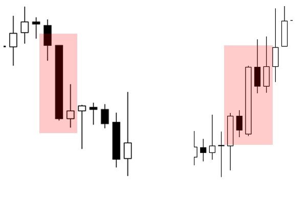
On the left, the marubozu was bearish, and even though the next candles attempted to turn the trend, the marubozu proved strong enough to resume the original downward trend. To the right, there was a bullish marubozu, and the upward trend continued.
Long shadows
These will appear around support and resistance levels, indicating that these levels are holding.
On the left is a long upper shadow, and these appear around resistance levels. The bulls tried to break through the resistance level, pushing prices higher, but the resistance held strong and the trend turned to the downside. The long upper shadow is a sign to sell because it confirms the resistance level is not going to be broken through.
On the left is a long lower shadow, which appears when prices hit a support level. The bears tried to keep selling, making the prices go down below the support level, but it was too much for them, so the bulls came back, reinforcing the support and turning the trend upward. When you see this, it presents a buying opportunity by confirming the strength of a support level.
Have you seen our reviews?
For a video tutorial on some of the aforementioned candlestick patterns, watch this short video: