 Alpari
 XM
XMLearning how to read forex charts is an essential skill for anyone looking to trade currencies successfully. Charts provide a visual representation of the price movements and trends of currency pairs, allowing traders to analyze and make informed trading decisions. While it may seem intimidating at first, learning how to read a forex chart is simpler than it looks.
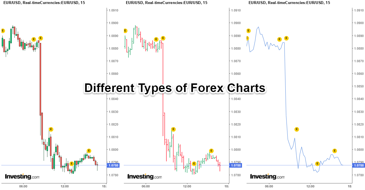
In this article, we’ll explain the basics of reading the three most common types of Forex charts:
-
line chart,
-
bar chart,
-
and candlestick chart.
A Forex chart is a graphical display that shows the price movement of a currency pair over a chosen timeframe. The y-axis shows the price scale and the x-axis represents time evolving from left to right.
By studying Forex charts, technical analysts can gain valuable insight into price trends, volatility, support and resistance levels, and trading signals that may indicate buying or selling opportunities. The three main Forex chart types have their own unique price action patterns, but all provide vital information into future market movements:
-
Line charts connect closing prices over time with a continuous line, creating an overview of the pair's price trend.
-
Bar charts show opening and closing prices as well as highs and lows for a specific period.
-
Candlestick charts build on bar charts by illustrating trading ranges between highs and lows with rectangle "bodies", while "wicks" above and below indicate market volatility.
When read properly, these charts illuminate patterns and behaviors to capitalize on.
Learning to analyze Forex charts is an indispensable component of developing an effective trading strategy. With practice, chart reading provides a window into the psychology of the Forex markets and paves the way for profitable trades.
Whether you opt for line, bar, or candlestick charts, knowing how to decipher Forex charts is one of the first steps to successful currency trading.
What is a Forex Chart?
In technical analysis, a Forex chart provides a visual representation of the price movement between two currency pairs over a set time. It plots the exchange rate on the vertical y-axis and time on the horizontal x-axis. Forex traders utilize these charts to identify:
-
trends,
-
chart patterns,
-
support and resistance levels,
-
and trading opportunities in the currency markets.
At its core, a Forex chart illustrates how the value of one currency fluctuates with another currency.
For example, a EUR/USD chart depicts the pricing behavior between the euro and US dollar. As the exchange rate changes, the chart creates a picture of the pair's price history and current market activity. Different chart types have unique formats, but they all contain the same price action DNA of the chosen currency pair.
Forex charts come in a variety of timeframes to suit analytical needs. Intraday charts like 5-minute and 1-hour charts reveal short-term price moves, while daily, weekly, and monthly charts highlight longer-term trends and behaviors. Learning how to read charts in forex is key to capitalizing on trading opportunities within currency pairs over time.
Understanding Forex Charts
At their core, Forex charts provide a comprehensive visual history of a currency pair's price movements over time. They aggregate and reflect every buy and sell transaction occurring in the market between the two currencies being analyzed.
Forex charts blend the trading activity and shifting expectations of all participants, from hedge fund algorithms to individual forex traders.
By condensing all of this complex market data into an accessible pictorial format, Forex charts allow traders to identify historical price trends, patterns, support/resistance levels, and trading opportunities. The assumption is that past market price behaviors and technical indicators may provide clues to future movements.
Many forex traders use charts to gain perspective on where a currency pair has been and where it may be heading.
Rather than focusing on fundamentals, technical analysts prioritize the current supply and demand dynamics revealed in Forex charts. As buyer and seller forces fluctuate, so does the exchange rate between two currencies. Charts provide a window into these fluctuations as they occur, updating with each new tick of market activity.
While no chart can predict the future, developing the skills to properly read Forex charts provides perspective on where opportunities may arise. Traders leverage charts to craft educated, strategic trading plans grounded in the aggregated wisdom of the entire market.
Types of Price Charts
There are three main types of Forex price charts that traders use to conduct technical analysis:
-
Line charts
-
Bar charts
-
Candlestick charts.
Each chart type offers a unique visualization of a currency pair's price action, providing valuable insights into the market's dynamics.
If you want to learn how to read forex trading charts you need to be aware that other chart varieties also provide unique views into market dynamics. For example, mountain charts show price ranges over time in a layered, "mountain" style formation. Meanwhile, tick charts display price action based on transactions rather than time intervals while point and figure charts eliminate noise by filtering minor price movements, revealing larger trends.
While line, bar, and candlestick charts tend to be the most widespread, exploring alternate forex charts like mountain, tick, point, and figure charts, and others can provide additional insight.
Each variety visualizes the same price data through a different lens, illuminating details that other styles may not capture. Traders often use a combination of various chart types across different time frames to conduct robust technical analyses of currency pairs. The more chart perspectives, the better grasp traders can gain on market behaviors.
Candlestick Charts
Candlestick charts build on bar charts by condensing the trading range into rectangular "candle bodies", with wicks above and below representing volatility. The closing price determines the candle color:
-
This body is colored green if the close is higher than the open, indicating buying pressure.
-
The body appears red if the close is lower than the open, reflecting selling pressure.
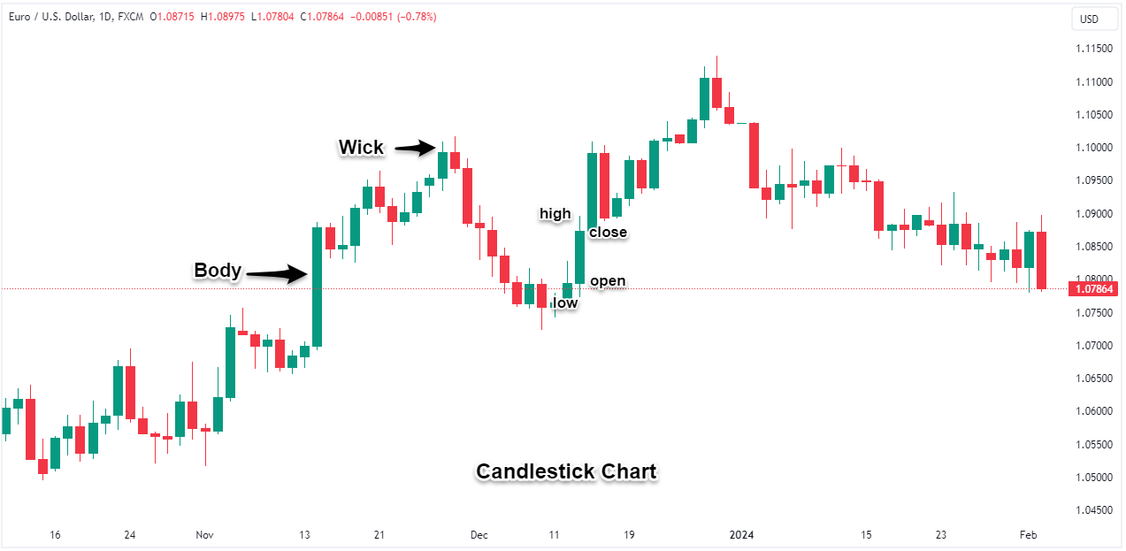
Thin "wicks" extend above and below the body to mark the high and low prices over that period.
Candlestick charts provide the most comprehensive price action data; by encapsulating open, close, high, and low data into candlesticks, traders can spot trade setups and execute strategies with greater insight.
Their colorful bodies and wicks visualize shifting momentum and volatility in an instantly recognizable way. Candlestick charts also allow traders to identify candlestick patterns, like the "hammer" which signals potential trend reversals or the inside bar.
Bar Chart or OHLC Bar Charts
Bar charts, also known as OHLC (open, high, low, close) charts, provide a more detailed view of a currency pair's price action than a simple line chart. Each vertical bar represents the trading range over one period, with the opening price marked by a left horizontal hash and the closing price marked by a right horizontal hash.
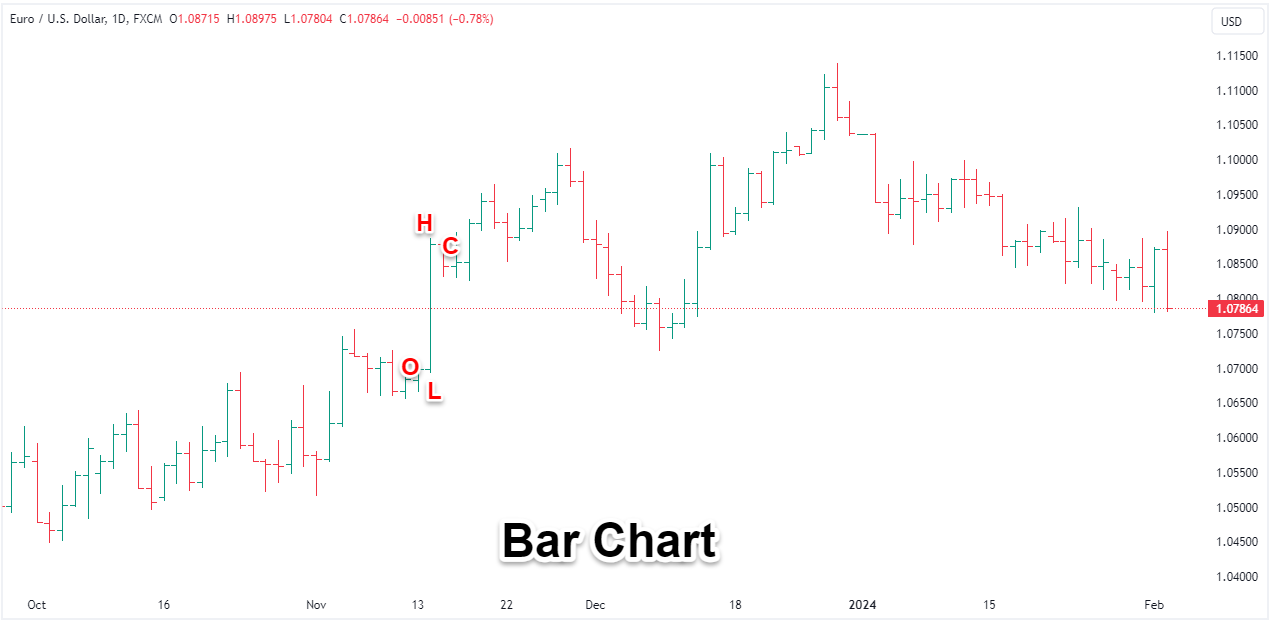
The top of each vertical bar indicates the highest price traded during that timeframe, while the bottom of the bar shows the lowest price traded. Thus, the height of the bar illustrates the period's overall volatility:
-
Taller bars signify wider trading ranges and more price fluctuation,
-
Shorter bars indicate tighter trading ranges and less volatility.
Beyond visualizing the price range, bar charts also capture the opening and closing prices which are key for gauging market sentiment. If the closing price is higher than the opening price, the buying momentum pushes the price up over the period and if the closing price is lower than the opening price, the bar-selling momentum drives the price down.
By condensing time periods into OHLC bars, traders can identify trading ranges, volatility trends, and buying/selling pressure at a quick glance. The bars amalgamate the chaotic price action into an orderly sequence of vertical line indicating price fluctuations and changing sentiment.
Line Charts
Line charts are the most basic type of chart, simply connecting closing prices with a line. By only plotting the closing price of each period, line charts smooth out intraday price movements to focus solely on end-of-period levels, which provides an easy-to-follow overview of the general price trends of a currency pair over time.
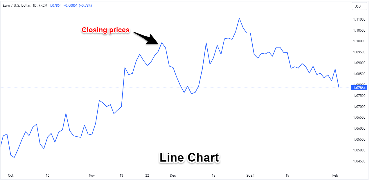
When closing prices are strung together into a line, traders can see the slope and overall direction of the trend:
-
Rising lines indicate an uptrend
-
Falling lines signal a downtrend.
Line charts excel at visualizing the prevailing trends across various timeframes. However, with only closing prices plotted, traders lack insight into the intraday volatility or the spread between high and low prices.
Some traders prefer line charts because they consider the close price the most important for analyzing bullish or bearish sentiment and trends. Line charts also make trendlines and channels simpler to draw. Yet many traders combine line charts with bar or candlestick charts to incorporate intraday price range and wick data into their technical analysis.
In the end, line charts distill Forex price activity down to its most basic visual – how closing prices change over time.
Mountain Chart
Mountain charts provide a unique perspective for visualizing long-term Forex trends. As the name implies, a mountain chart depicts the exchange rates through a shaded, mountain-like silhouette of the line connecting closing prices over time. The shaded area underneath the line fills the space between the horizontal axis and the closing price.
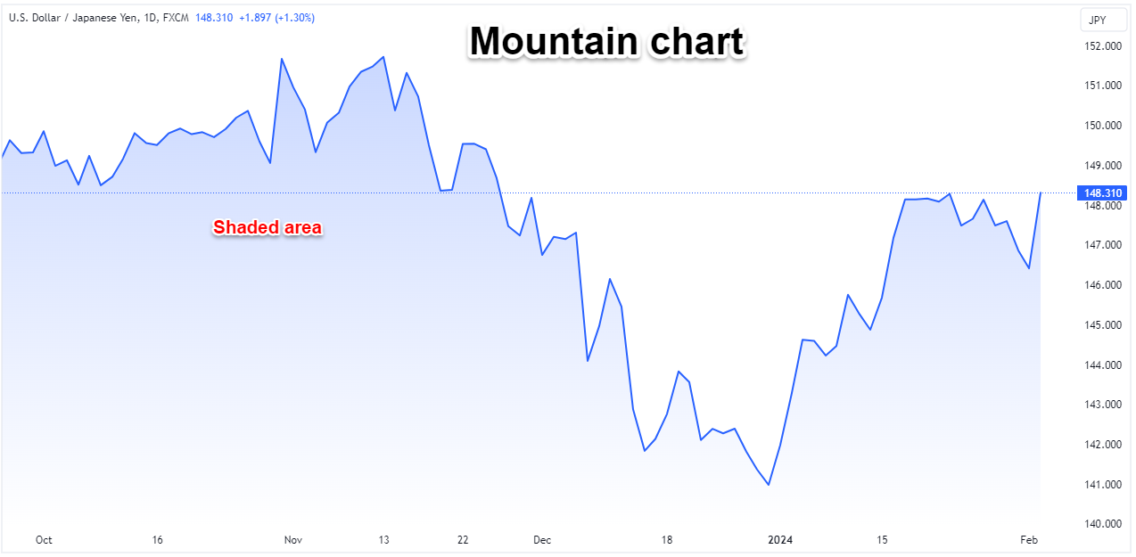
While mountain charts do not show details of highs, lows, and opening prices like bar or candlestick charts, the mountain shading draws attention to the prevailing price direction. This type of chart filters out short-term oscillations to highlight longer-term trends spanning days, weeks, months, or years.
How to Read Candlestick Charts
When you read Forex chart, there are two essential components:
-
the price/time axis
-
and exchange rate pricing in pips.
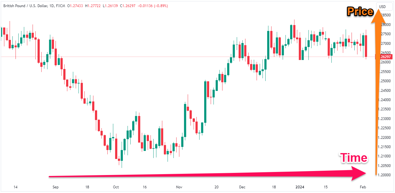
The horizontal x-axis shows the time periods while the vertical y-axis displays the exchange rate price, which allows traders to assess price movements over time.
For example, an uptrend is visible when exchange rates rise from left to right across the chart, indicating buying momentum in the market. Downtrends feature falling exchange rates over time as selling pressure pushes prices lower.
Exchange Rate Pricing – Pips
The magnitude of price movements is measured in pips – the minimum price increment for a currency pair.
Pip movements determine potential profits and losses. If a trader buys at 1.2000 and sells at 1.1900 when each pip is worth $10, they have lost 100 pips equating to $1,000. However, selling at 1.2000 and covering at 1.1900 would gain 100 pips for a $1,000 profit.
Learning how to read a forex trading chart provides the basis for making informed trading decisions. While simple in theory, mastering chart reading requires experience. Factoring in position sizing, risk management, and analyzing candlestick patterns takes practice.
How to read different types of forex charts
While line, bar, candlestick, and other chart varieties have unique formations, the basic process of forex chart reading remains the same. Here are some tips on how to read forex charts beginners can apply:
-
Identify the currency pair and time frame depicted on the chart to understand what market and period is represented.
-
Note the price scale on the vertical y-axis and ensure you understand the scale unit (pips, points, etc). Also check the time increments on the x-axis.
-
Look at the overall structure and slope of the chart to determine if there is an uptrend, downtrend, or sideways consolidation.
-
Note where the chart hits points of support or resistance as these often signal reversals or breakouts.
-
Look for patterns like double tops, head and shoulders, wedges, channels, or flags that may indicate trading opportunities.
-
Compare historical levels, indicators, and volatility to identify ranges or changing market conditions over time.
While each chart type displays unique formations, these basic analysis steps apply across the board. Learning how to read forex chart takes time but with practice reading different charts, forex traders start recognizing recurring patterns, behaviors, and trading signals.
Forex Charting with Technical Indicators
While the price chart provides the core graphical foundation, traders can amplify their technical analysis by adding indicators that reveal momentum, volatility, and potential entry/exit points.
Forex indicators
Common technical indicator types include:
-
Overlays like moving averages that plot over the price action depicting smoothed price trends and dynamic support and resistance levels.
-
Oscillators like RSI, MACD, Stochastic that fluctuate above/below the trading chart. Oscillators quantify momentum and overbought/oversold conditions.
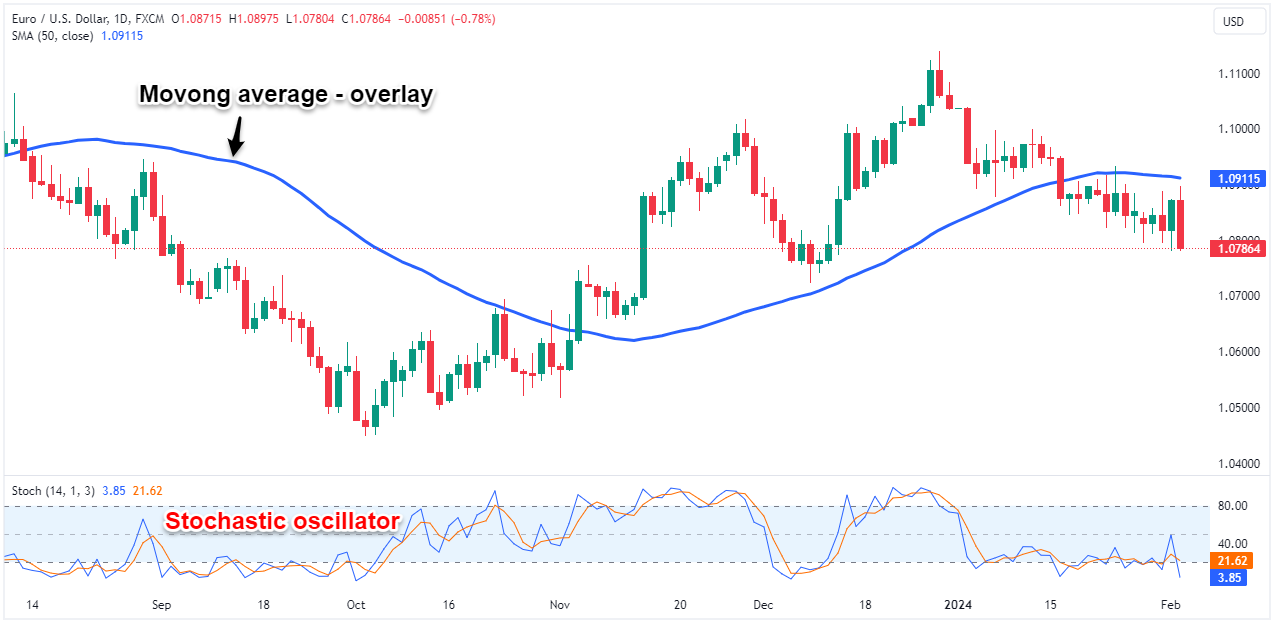
Technical traders use indicators to confirm or contradict the signals arising directly from the forex trading chart. For example, prices breaking out while oscillators show overbought conditions may signal a false breakout. Indicators also identify trading opportunities through crossovers, divergences, and overextensions.
Forex traders can access a wide range of customizable technical indicators through most trading platforms and charting software. It's important to research and backtest to find the most relevant indicators for your strategy.
When added to any candlestick chart or any chart type, indicators become another source of forex trading signals and confirmation. Savvy traders learn to combine multiple indicators across varying timeframes to identify high-probability trades with optimal timing.
Forex charts and time frames
One of the key decisions when analyzing any financial instrument is choosing the time frame – the period of time each candlestick or bar represents. Forex traders utilize charts across time frames ranging from 1-minute up to monthly.
Understanding Price Chart Timeframes
-
Shorter time frames like 5-minutes reveal short-term, intraday price action,
-
While longer time frames like daily or weekly charts highlight major trends.
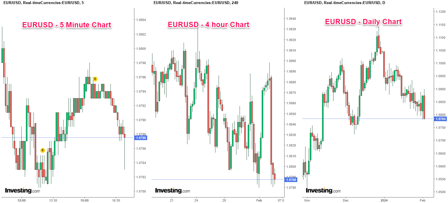
Intraday traders favor short time frames under 60 minutes to capitalize on minor price oscillations and volatility. Swing traders studying trends may use 4-hour or daily charts and position traders focused on long-term directional moves may even look at weekly or monthly charts. Traders often incorporate multiple time frames into their system to gain perspective.
Best Forex Brokers for Learning How to Read Forex Charts
Choosing the right forex broker for learning how to read forex charts can be overwhelming, but it's crucial to consider factors like:
-
platform features,
-
educational resources,
-
chart types,
-
and account types before making a decision.
Here are some of the best forex brokers for learning how to read forex charts, keeping in mind that it's important to do your own research and compare options before choosing one.
How to Access Live Forex Charts
There are several ways to access live forex charts, each with its own advantages and disadvantages. Many financial news websites offer free forex charts, such as:
-
Investing.com: https://www.investing.com/charts/real-time-forex-charts
-
Topbrokers.com: https://topbrokers.com/forex-charts
Some brokerage platforms offer live forex charts even if you don't have an account with them. Examples include MetaTrader 4, MetaTrader 5, and TradingView which have forex charting tools all for free.
Using technical analysis to forecast FX prices
While learning how to read forex charts provides a foundation, traders use more advanced technical analysis techniques to identify trade signals and forecast future price movements.
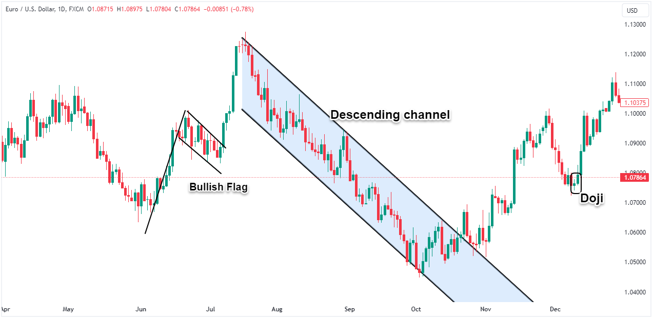
For example, certain candlestick formations like the "morning star" often indicate potential trend reversals. Chart pattern analysis also looks at phenomena like price channels, flags, head and shoulders, and more.
No analysis can predict the future with certainty but, technical analysis helps traders gauge the likelihood of various outcomes based on how the market has behaved historically when similar formations appeared. It aims to calculate the odds rather than foresee the unforeseeable.
Identifying Forex Trading Patterns on Candlestick Charts
Beyond basic trend analysis, traders leverage candlestick charts to identify recurring patterns that may signal trading opportunities. Certain candlestick formations tend to precede predictable market behaviors that technical analysts aim to capitalize on.
Some of the most common candlestick patterns include the:
-
doji which signals indecision,
-
spinning tops representing volatility,
-
hammers indicating potential reversals,
-
and engulfing or tweezer patterns showing shifts in momentum.
Popular continuation patterns are rising/falling three methods and up/down gap side-by-side white lines.
Combining candlestick patterns with other technical analysis tools like volume, momentum indicators, and pattern validity criteria to confirm trade signals creates a multilayered system. For example, a candlestick signal occurring at a key support/resistance area carries more weight.
Final Thoughts
In the end, the charting techniques and tools traders choose depend entirely on their strategy and analytical approach. Candlestick charts best suit pattern traders, while trend followers may prefer line or bar charts. Heikin Ashi and mountain charts smooth out noise for long-term positional traders.
It's common to incorporate multiple chart types and timeframes to gain a multidimensional perspective. Intraday scalpers may use 1-minute charts for entry/exit timing while also referencing daily charts for the prevailing trend. Adding indicators creates another analytical layer to confirm or contradict chart signals.
The beauty of Forex charts lies in their versatility – traders can customize them to their personal strategy. Whether using basic or advanced analysis, charts transform market noise into orderly visual insights.
Now that you understand the basics of reading Forex charts, the next step is finding a broker that provides the advanced charting capabilities you need. Rather than deciding on a single broker, use our customizable comparison table to shop and compare multiple top Forex brokers at once.